After the white...
In two previous blogs, I wrote how the color white is on its way out as a trendy color. White backgrounds, white sashings.....the newest patterns are minimizing the color white to a little accent color somewhere in the block. At the same time, the blocks are getting much bigger in size making the idea of a background color not that important. Instead of a background and fabrics on top of it, most contemporary quilts are much more in one level/layer of equal partner colors. I believe it is
Modern Quilt Studio that came up with the word "ensemble" colors for the phenomenon: Harmony between the colors without making any color the dominant one for the background. Not a surprise as Bill Kerr and Weeks Ringle look at and think about color with an almost academic approach. I am a big fan of their work, it's thoughtful and beautiful at the same time.
If we need contrast, how do we still get contrast if white is not the first choice of color? We came from beige before that, are we going back to beige/cream? No. Beiges and creams are definitely colors with a renewed interest but they are not taking the place of white. Grey is also no longer the color of choice, because it has been overused everywhere. Grey is still important, but has become, just like white, an accent color.
For a while "greige", a mix of grey and beige, has been pushed as the new color but that didn't really stick either. In general we are seeing a strong shift from the cool side of the color wheel towards the warm side and I think this shift may have been so strong that greige was still too cool. It therefore is also no surprise the "new white", the color that has the function of white, is also on the warm side: It is a very pale pink/orange that has undertones of brown and taupe. Very often it goes by the name "nude", "French nude" or "dusk", names that hardly describe the color (and I don't get the French part). "Blush" and "Porcelain" are the best names I have seen for it. I actually don't think it is one color yet that is the clear winner, it is more a palette from the softest pinks/melons/oranges you can find. In nail polish you see the color, also in ladies lingerie. Really is that the color coming up? Yes, it is!
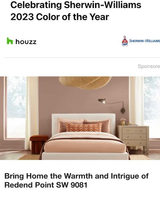
Take a look at Sherwin WIlliams' Color of the year: Redend Point SW 9081, a neutral with a clear warm family background. Or
Malted Milk, the color just selected as the color of the month April. Malted Milk is also a light neutral, but more peachy orange with a brown undertone. That's the direction it is going at the moment!
In most quilt shops the color is rather hard to find as most companies are still completely staying away from it and make the color much more pink, more peachy. It should be a much softer taupe with a hint of pink/orange! Some of the trendiest companies (Art Gallery Fabrics, Ruby Star Society) have introduced the colors in the collections. I found a great piece by Laura Berringer for Marcus Fabrics, a company more known for historic fabric than contemporary cottons. It is called
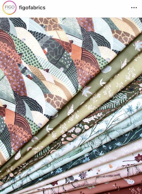
Fade Away and this is definitely a fresh look for background fabrics. Also, Figo Fabrics, the modern branch of Northcott, in its new lookbook for the Fall is showing the "Trek" collection. This collection has the color in it too, so slowly we will see the color that has been "hot" in interior design showing up more and more in the Fall. I'm adding a picture I took at my local Target a few weeks ago. Their home decor section is full with it.
If you want to try to find the color, start with the light beiges and then look for any that have some kind of red in them. Most become too yellow or too brown quickly.
Before you go to a paintshop and look at the paint chips, please know that these colors show up much lighter on the wall than the paint chip suggests. In general, it is very tricky to look at colors of paint chips in the same way as color in fabrics. I know it is great fun when Bonnie Hunter does her paint chip mystery, but paint chips look totally different when painted on a wall. Even totally different on different walls because of the presence and reflection of light. If you would put the same color paint on all the walls of your house, you would still end up having different colors for that reason.
That said, it is true that all these newer colors are definitely darker than white and cream and that's a trend by itself. After years of going lighter and lighter, we reached the bottom of the valley of light colors. The trend is making a curve and we are seeing the darker colors come up again. We are at the very beginning of this, so I'm sure I will write about that another time.

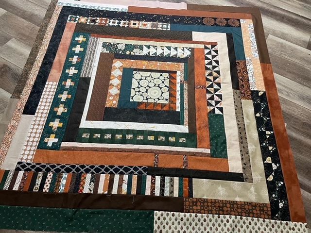
In one of my first blogs I wrote about Grassroots 108 by P&B fabrics. One of those extra wide fabrics is the backing for my "Trends on the couch 2023" quilt that I made for my lectures, just to have a reference for people to see the latest trends in colors for family rooms. A close look at this fabric, shows you the soft blush that is in the background. That's exactly the reason why I choose this backing. Most people are not even seeing this (it's definitely a neutral color), but when I point the blush accent color out during a lecture, they can clearly see it. This is how slowly our senses for colors are getting influenced!
This backing looks awesome with the top, in color and theme, as nature inspired fabrics are really the hottest trend right now in interior design and quilting fabrics alike. For the pattern I used Daylesford by Jen Kingwell out of her Quilt Recipe book. As you can see it is a blown up version of a log cabin (huge block). The fabrics I selected are all fabrics with natural and textural elements. The colors are equally important and natural: dark green ("forest night" or "bottega green"), one of the newest colors of the moment, medium browns, blush, rust, brown and black as the main colors. I believe this quilt could fit in any new 2023 family room. If anyone is interested in a kit, I can gladly made this up for you. All fabrics will be labeled. I actually made a custom kit of this pattern in other colors for a customer as well. Fun!
By the way: P&B told me that they are going to print this Grass Root collection indeed in 45" width, just as I suggested to them when the 108" fabric came out. It will come in 27 colors to shops in October. Exciting!