


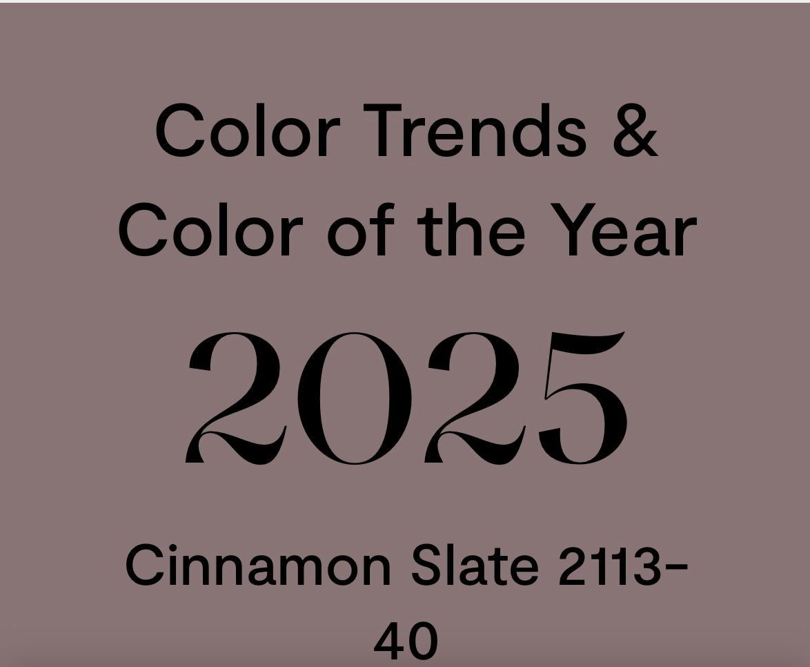


Another interesting fact is that both brown colors are really an obvious combination of colors. Cinnamon Slate is a mix of heathered plum and greyish brown. Mocha mousse has brown and pinks. They are not open, clear colors, but "in between" colors that are hard to place. They are layered, have multiple colors in them. Trendy for 2025 are colors that are mixes of colors, MULTI here too. I explain it in my lecture to quilters this way: imagine you have a some piles of blue, green , purple and grey fabrics and you want to sort some more fabrics to the piles. Most fabrics are easy to place. They are clearly blue or purple. All those colors are not the trendy ones. New for 2025 will be the use of many "in between" colors, colors that make you hesitate where to put it: is it more blue or more green? Purple or grey pile? Brown or pink? These in between colors are coming from a second trend: looking back. Vintage, reproduction, reformation are the words connected with this and we see a revival of historic colors, especially the colors used outside in the past.
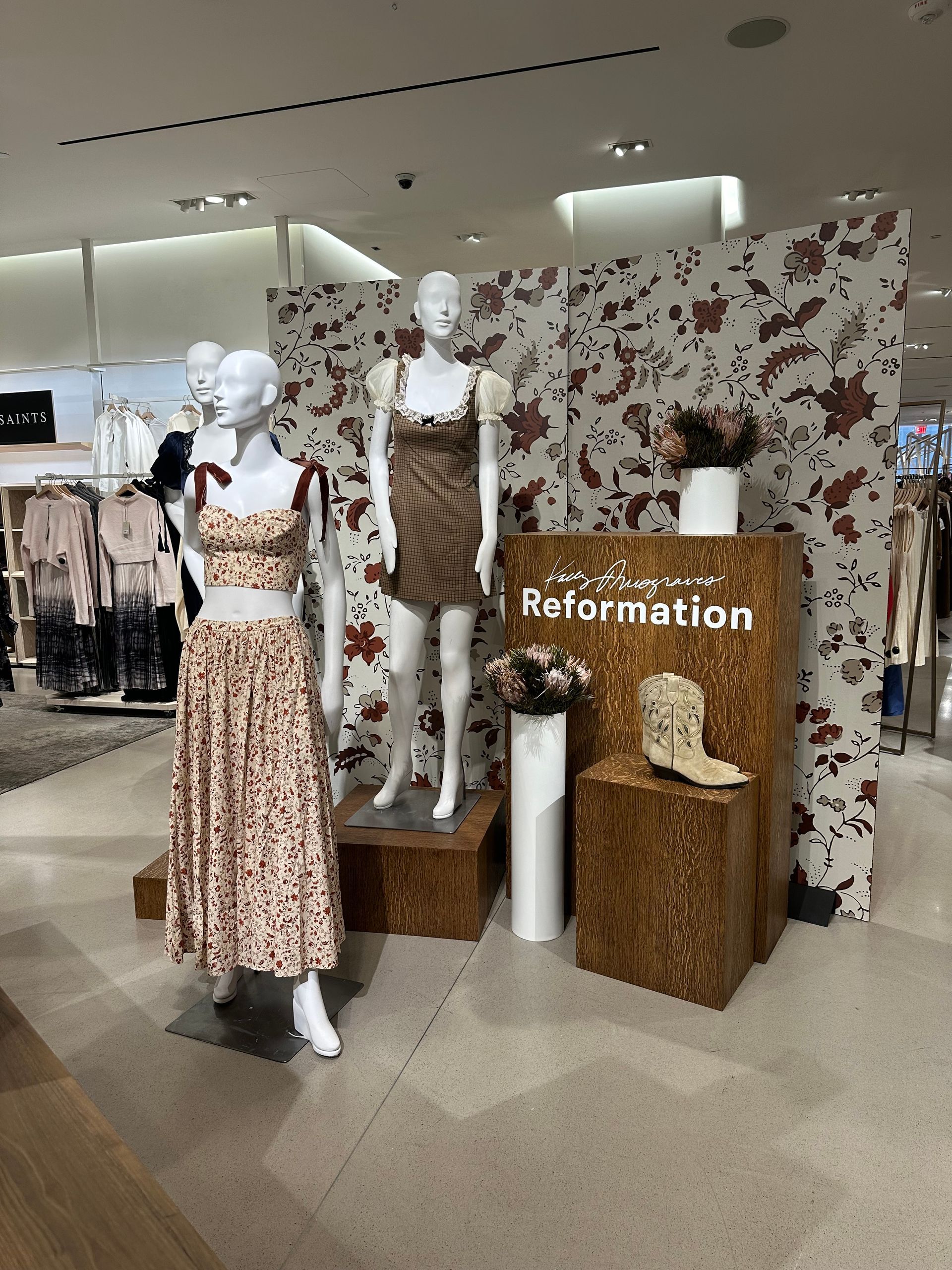
A few weeks ago I was visiting my daughter in NY City and Nordstrom had a big display with the title "reformation". It looked like a Little house on the prairie style. Lots of beiges and browns with rosy accents. Many little flowers on dresses and big flowers in wallpapers. Very nostalgic. Actually most of the floor had the same colors as Pottery Barn. Do I like it? Will I wear any of that? Nope, not an entire outfit, but I may combine a shirt in that style with some dark gray for a winter outfit. There are others that can get excited about thoses dresses, that I wouldn't even wear in my favorite colors (which were one floor higher;)) Target has many racks of this kind of clothing that is not for me, but young girls are grabbing it! They grew up with an abundance of bright colors and are ready for another look. They have never seen the dustier/duller colors before.
On a side note: I just read an article about "beige moms". Apparently these are mothers trying to expose their children to a broader variety in colors... not only brights! I am definitely a beige grandparent as well, because I find it frustrating that all the kids' stuff is in bright rainbow colors. Over and over again, always the same. As if kids can only be happy that way. The other day Nora wanted to draw the sky and complained she didn't have light blue in her selection of markers. Only royal blue. Of course, I looked for a set of non-bright colors, and had to go to the adult section of the shop to find such a set. That is crazy. Kids should be able to play with all colors. Now she can make light blue skies, grey clouds, brown trees and still use the bright for her endless flowers. She too thinks it looks much better (and loves the fact that I took her comment seriously).
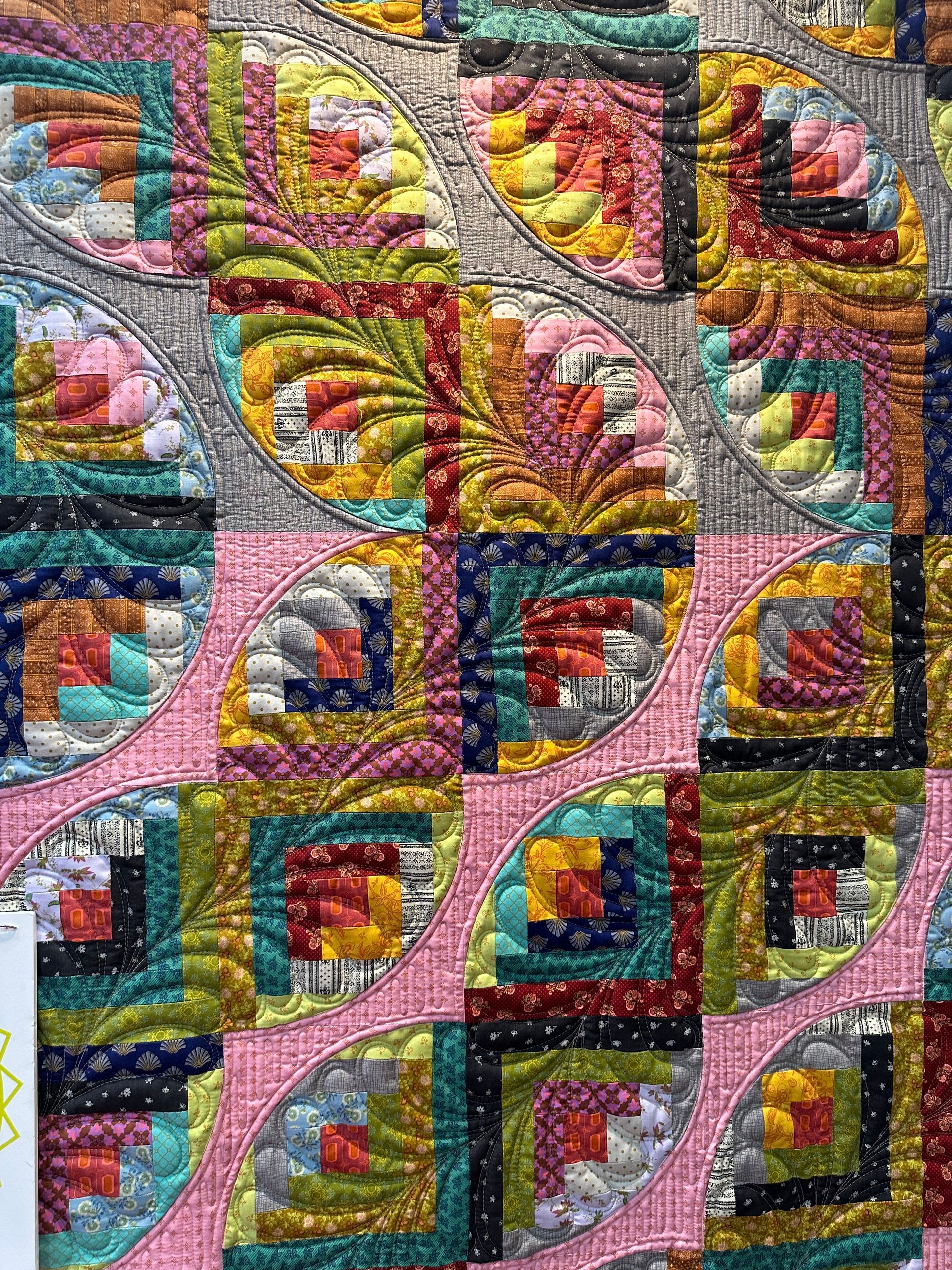
For quilting, the trends of multi and going towards darker colors together lead to busy small prints in darker colors. The prints can be darker, the backgrounds can be darker, but the total look will be very much darker than 2 years ago. Liberty of London and Calico designs are very much in the picture, but only in darker colors, not sweet pastels.
I mentioned in my last blog that Anna Maria Textiles was the winner for me at Market. All Anna Maria's collections for 2025 will all be available in 3 different color ways. Anna said in her schoolhouse presentation: "not very matching, but more an eclectic collective mood of colors". That is her way of saying: MULTI. Her 3 colorways are: Dusty (vintage) , Cheery (brights) and Lush (darker, bohemian, which is really Anna's favorite). So smart and so good! With these 3 color stories she picks up the leading trends of vintage and dark and combines it with the less trendy but always commercial bright colors. She covers 2025 in every collection for her quilting community.
Other designers and companies are doing this as well but they cover often only one part. For instance, Andover is reprinting old favorites of Jo Morton who is back with Andover after a couple of years with Moda. Andover reprinted her best super classic lines, but they didn't look back with new eyes at the classic lines. They reprint it just as it was/is and are using it in the same way. I hope they have an audience for this. It didn't do much for me and I have sold those fabrics years ago because they were great collections indeed! Vintage means "inspired by the past" but still adding a current twist to it. That is not simply going back.
The Little girls on the prairie display at Nordstrom was vintage inspired and the girls may have worn the same kind of dresses. However their poses and surroundings were very much those of independent, today' s females, who didn't seem to miss their old environments. Inspiring marketing!