My view on this gorgeous day is the blue of the sky and the water of the Chesapeake Bay. A little bit closer by, the colors of sand, shells and an occasional beach spider bringing fresh sand out of the hole it is creating. This blue/beige color combination is a personal favorite. It is classic and classy, looks always good on people and walls....and it is open to a lot of accents that can take it into surprising directions. My husband and I are about to remodel our master bedroom, after sleeping there for 22 years without doing much to the room. Carpet is finally going out and getting replaced by hardwood and the blue/beige color scheme of the house is going to be continued in here as well. We feel comfortable in those colors as a base and it gives me room to bring in accent colors in shades of yellow greens and straw yellow, the color that is connected to the South of France and the city of Hoi An, Vietnam.
It is quiet here on this beach. The water is calm and there are only a handful people enjoying the scenery. What a luxury to be able to do this! One of the benefits of working the way we are now, is that we can visit places of nature on weekdays in stead of Sundays. It's every time a different experience and we always express to each other how lucky we are.
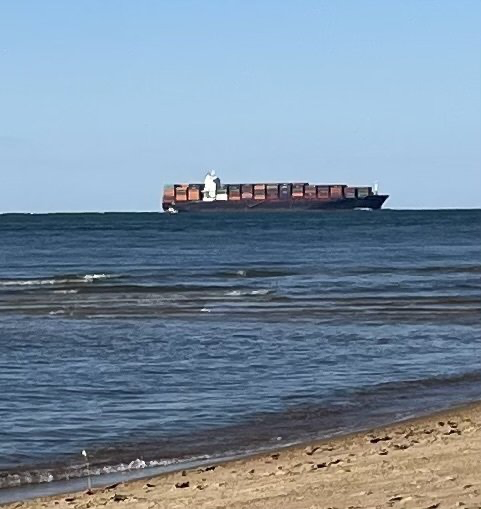
In this relaxing place, I turn myself around and suddenly , I see a big vessel on the water. It’s loaded with containers. All those colored containers in a nicely stacked pattern, almost like a gigantic design wall. I admire the beauty of this vessel and the color action it brings. Some people may feel this vessel is distracting the endless view of the Bay, I see it as a friendly "wave" of another kind. It makes me happy to see all those colors.
I suddenly realized that containers have a bad press lately. The word container is used in a negative way to describe the supply chain issues. They are not doing anything, making goods expensive, and are sitting in a harbor...yet these containers today are beautiful and actually moving pretty fast. Clearly, I have a soft spot for those colorful rectangles on the move. Their contrast makes the water and sand even more blue and tan. I remember how my friend Ineke and I admired the freight train out West while driving on our way to QuiltCon in Pasadena CA. We both loved the worn colors of the vintage and distressed containers that gave so much warmth to the bare tan of the mountains. It was like a big line of Grunge on wheels!
And the many containers in the harbor of Rotterdam, The Netherlands, much shinier in my memory than the train containers out West. Would such a train container ever get to a harbor in Europe? Or is it the different color of the natural day light that reflects on the containers differently?
My mind is searching my memory for other places with containers…Crazy how you sometimes realize that you always liked something without having been aware of it.